Design Method
Fizzy Flower – Website Relaunch
Owner of Fizzy Flower, Claire Wenban, approached Pelling Design to re-brand and re-launch her online jewellery store. Our brief was two fold; firstly create a look and feel that captures and shows off the quality of the jewellery, and secondly make the website more user friendly for both her and her customers.
Fizzy Flower was a success before we got involved, which was remarkable considering the limitations Claire was working with. We were therefore excited about what we could bring to the table by implementing a more modern, clean and engaging design that focused on increasing usability and of course, sales.
BRANDING
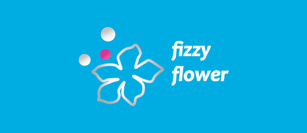
Using the jewellery as our main inspiration we started by redesigning the logo. The old version is shown below:
We felt that the old logo lacked the elegance needed and therefore made the following changes:
- We replaced the colour scheme with a more subtle tri-tone colour scheme of white, grey and brown, as the old pink and blue was too vibrant.
- We removed the gradient effects.
- We changed the font to something lighter.
- We combined the flower and 3 orbs so that together they have more impact.
- We added the word “Jewellery” within the logo so that it’s clear at a glance what Fizzy Flower actually does.
We created several variations of the new logo and sent it to Claire for review. After some feedback and amendments, this is the final version we ended up with:

Once we made sure Claire was happy with the logo, we went on to roll out the chosen designs across the website, stationery, leaflets, brochures and gift cards.

WEB DEVELOPMENT
As an online-based business with no physical shopfront, the website is a fundamental part of Claire’s business. A lot of work has therefore been carried out on the website to increase functionality, customer engagement, usability and subsequently, sales.
Changes included:
- The redesign of the website itself to align it with the new branding.
- The set up of a mobile/tablet specific version of the website as a large proportion of the visitors were accessing it via phones/tablets.
- Social sharing buttons were added to leverage social networks and its’ viral nature.
- The newsletter signup form was fixed so that any signups are sent directly to Claire. The previous developer had it set to send to them instead, which obviously isn’t ideal.
- The ability to sort products by price was added.
- A large proportion of the member account page had been hidden by the previous developer, which significantly reduced usability. These were added back in.
The process of optimisation never ends, and we are constantly working with Claire to find more ways to improve the website. To view the current state of the website please click on the button below.