Working with colour can be very exciting! We have so much choice and then we have the option of adding other colours to create a palette. The balance of multiple colours adds a whole other dimension and just changing one of these can create a whole different feel.
Colour combinations are all around us: outside, inside, on people, on animals and insects, in shops, on websites, in galleries … I could go on …
Colour Communicates
The leaves on the trees in spring are a fresh bright green, communicating to us their freshness and they bring with them the promise of summer ahead. During a hot summer we may see brown grass. This tells us good weather has been enjoyed and the ground is lacking in water. Brightly coloured flowers attract the bees, and male birds are more colourful to attract their mate. We can learn from creation that colour is a powerful tool, and can be used for a variety of purposes.
We use colour to guide us in our road systems on road signs and traffic lights.
Colour can signify different things to different cultures, so consideration of this is important when communicating across cultures.
When choosing a colour palette you need to first answer a few questions:
- Who is the target audience?
For example, if you are aiming something at a 45 year old man, they would appreciate a different colour palette to an 18 year old girl. - What is the message you want to communicate?
Is it serious or fun?
Mature or fresh?
It is good to brainstorm a few words so these can help you focus correctly. - Will the colours be used on screen, in print or both?
Colours on screen will vary depending on the screen they are viewed on. Pantone colours are for printing and will always print consistently. - Will the colours signify anything and be used by separate areas of the business?
Colour can be a great way to aid your audience in navigating through information.
How to choose colour
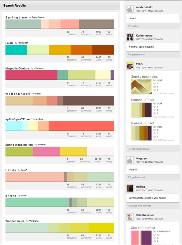
There are many places you can go to be inspired about colour, some of which I have mentioned above. The website COLOURlovers can be a great place to start. This is an online community were members can submit colour palettes. On here you can search key words and it will display colours or colour palettes based on that subject.
Kuler is another great site. Here you can move the points on a colour wheel and it mathematically picks complementary colours to go with what you have chosen.

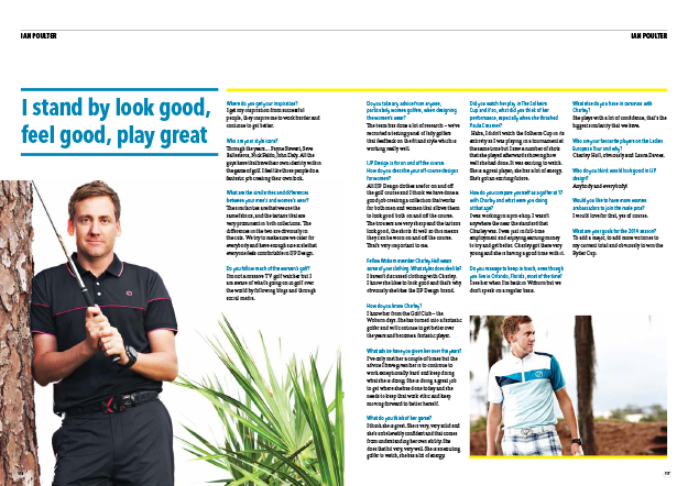
Another way of choosing colours is to find a photo which has the type of colours you are looking for. Using the eye dropper tool in Photoshop you can ‘collect’ the colour value from a point in the photo and make a swatch from it. Below is an example of where I used this on an article in Golf Chic.
I hope the above tutorial fills you with inspiration about how colour can work for you and your company. If you ever need any guidance with colour, the team at Pelling would love to use their creativity to provide you with the perfect solution.